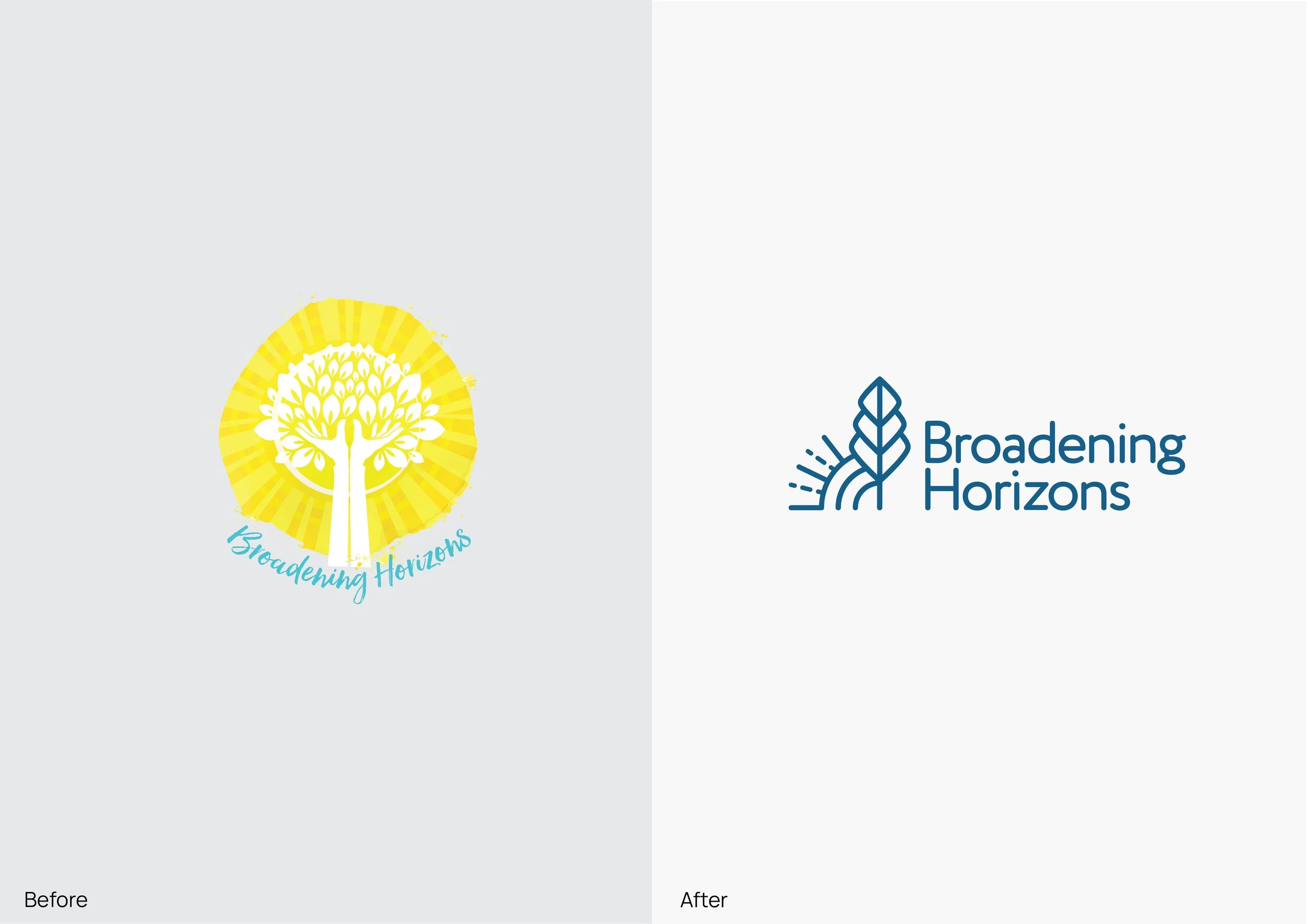
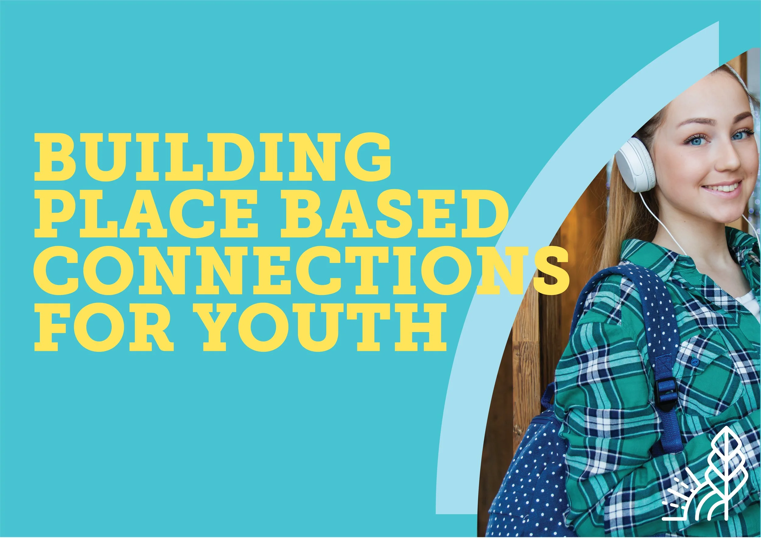
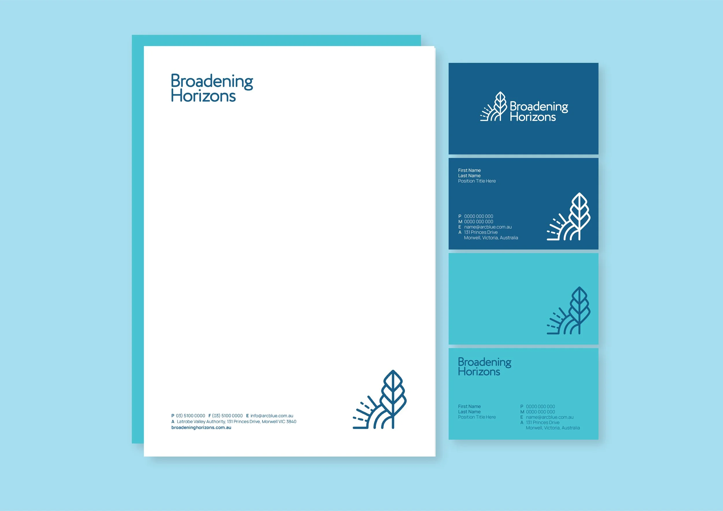
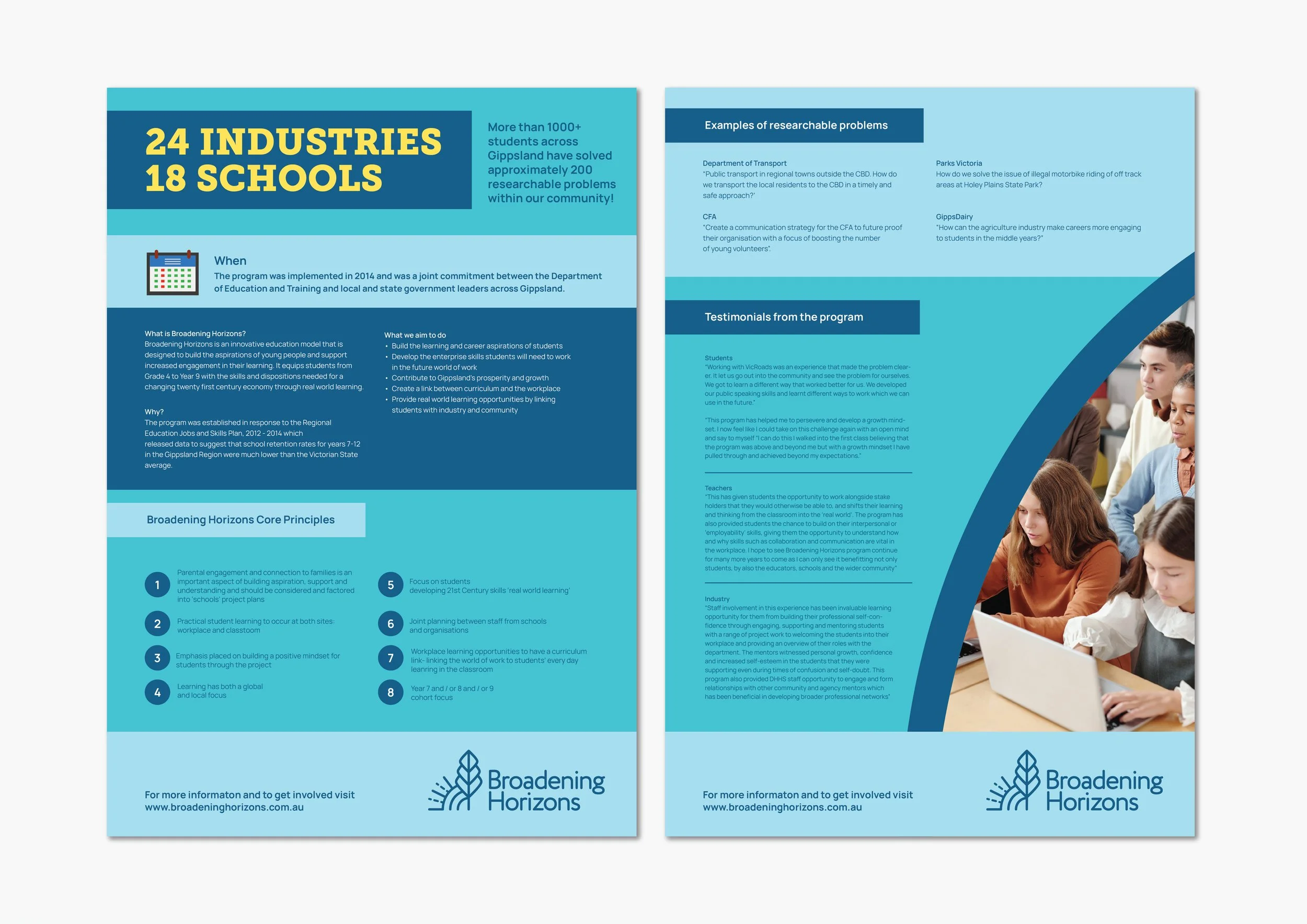
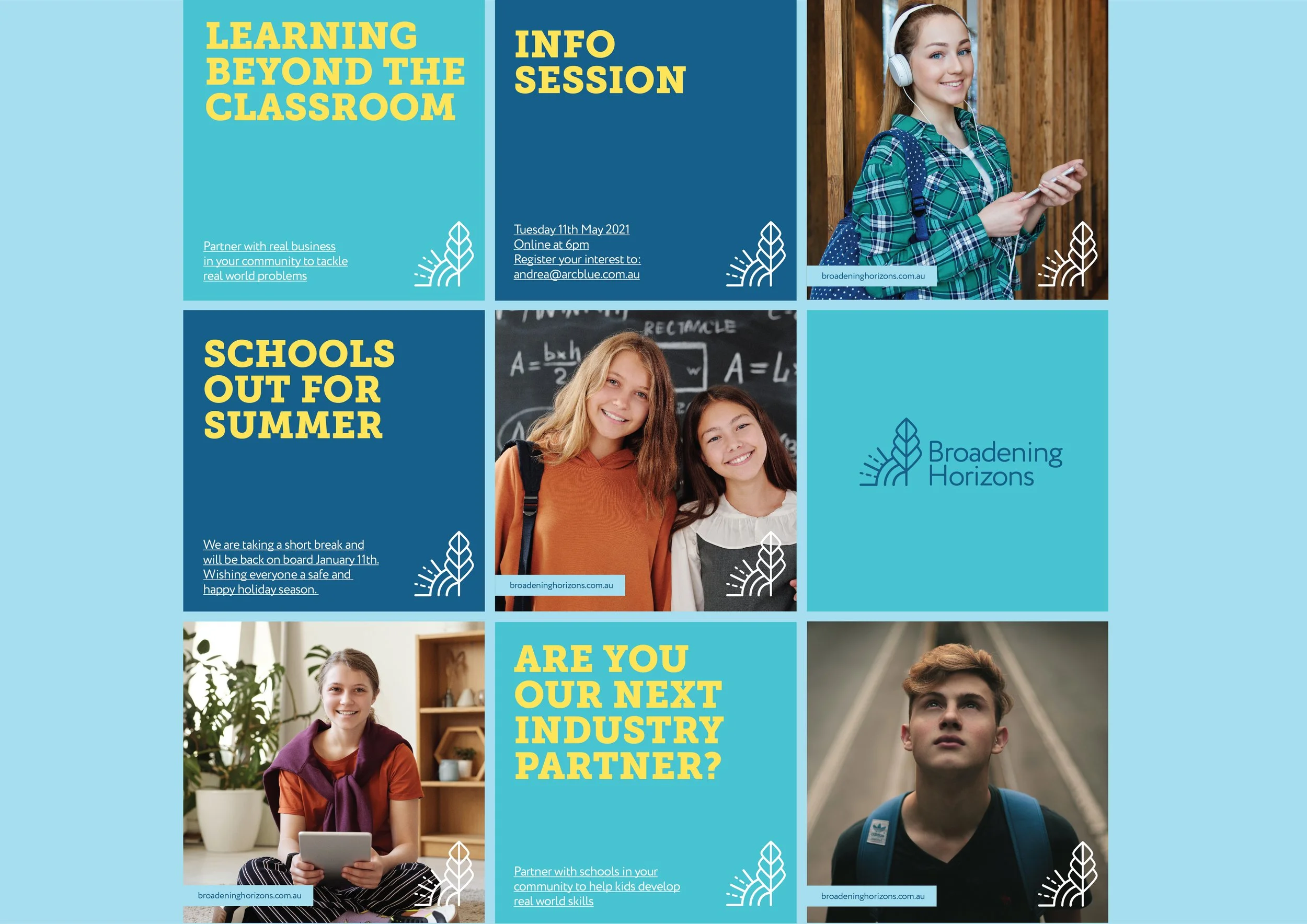
Broadening Horizons (BH) is an education innovation program in Gippsland which facilitates schools with industry partners in order to create real life learning for students. Their original logo was co designed by students when the program began but an overall brand was never created meaning across all mediums a consistency lacked. BH wanted to keep the meaning of the original logo but modernise it as well as creating a consistent brand for ongoing use. The original logo consisted of the following elements: Hands (partnership), Tree (growth) and the Sun (aim of program). These elements were re invented to create a more simple icon form for the logo that was modern and easily recognisable. The Sun & Tree elements were retained with the Hands transferred to the 3 layers of the tree being the partnership between schools, industry and BH. With the new logo a brand was also created replicating the curves from the sun as colour block and image frames within items such as newsletters, flyers and banners. The colour palette was slightly tweaked to retain a selection of blues with a pop of bright yellow. In addition to the brand design a range of templates were created including Business Cards, Letterhead, Forms, Flyers, Newsletter, Social Media & Powerpoint Presentation.

